Justtone Fitness Logo Design
OVERVIEW
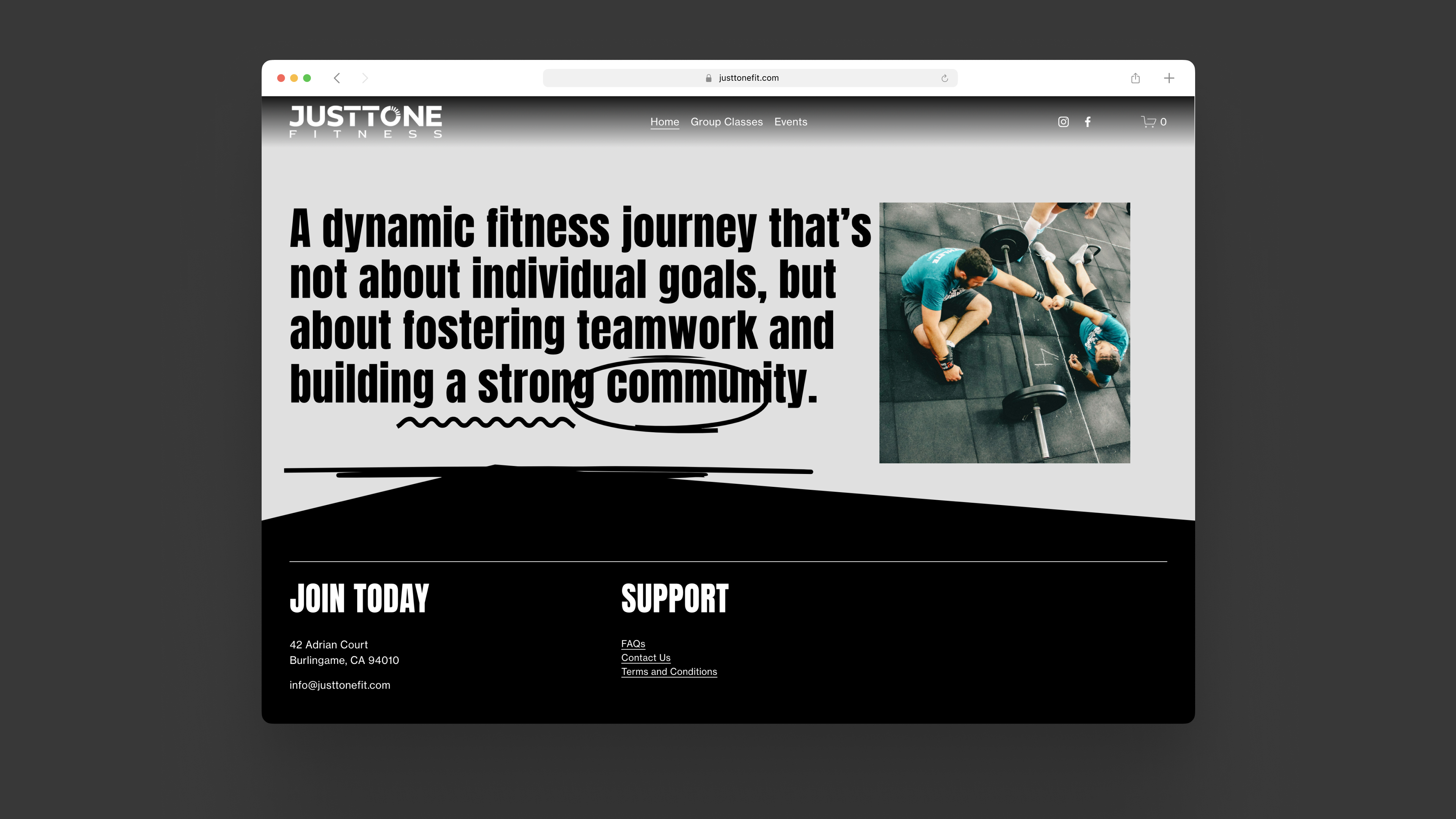
Justtone Fitness is a new fitness gym in Millbrae, California. The brand stands for progression in their community–despite of anyone’s fitness journey level.
My approach to design its manifesto is through incorporating progression into its minimal logo design.
Introducing the Progress Loop. Read more about the Loop at the bottom of this page.
My approach to design its manifesto is through incorporating progression into its minimal logo design.
Introducing the Progress Loop. Read more about the Loop at the bottom of this page.
CLIENT
Justtone Fitness, based in Burlingame, California
Justtone Fitness, based in Burlingame, California
SCOPE
Logo Design
Logo Design

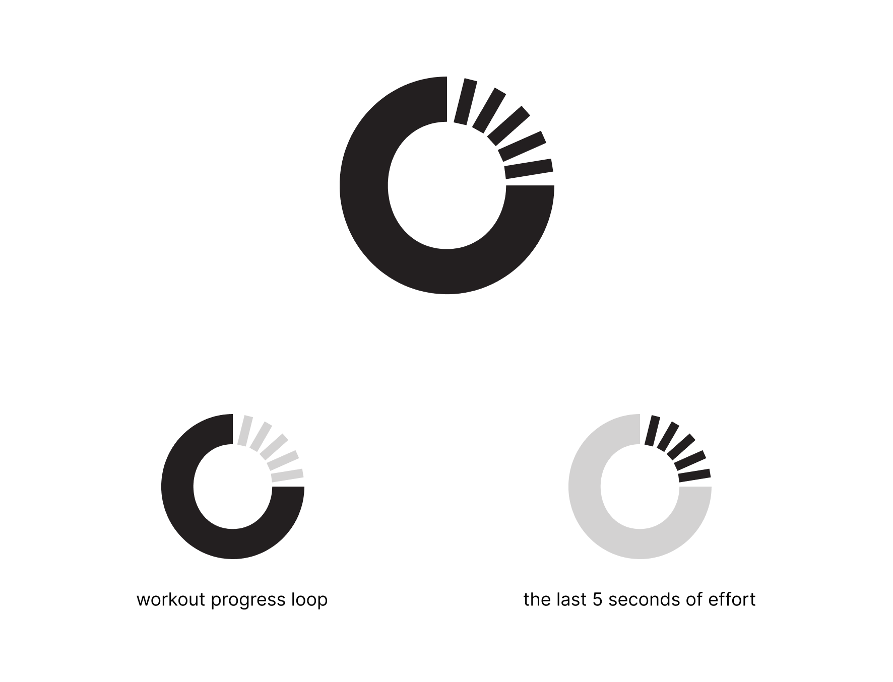
The Progress Loop
A good logo is defined by its ability to scale, be memorable, and resonate with its audience. Let's break down the meaning behind the "The Progress Loop" icon, which captures the essence of what JustTone Fitness stands for.
We may arrive at the gym on different paths, but the victory lap feels the same for everyone. It's that intoxicating blend of accomplishment, triumph, and self-improvement — a feeling you can chase every workout with the community at JustTone Fitness.
This feeling of victory is precisely what The Progress Loop icon encapsulates. Designed in a minimal and modern style, the progress loop shows the final five seconds when your muscles scream surrender, but your spirit roars defiance, pushing you closer to victory. It's an indication that you're about to finish the lap — perhaps setting yourself a new record — pushing yourself harder, one loop at a time.
Merchandise

Website
SEE OTHER CASE STUDIES