Pat C! Brand Identity
BRIEF
Pat C! is a warm, minimalist gelato and frozen yogurt store with fresh fruit toppings. It's the perfect spot to hang out with friends and family, feeling like you're at your cool nuna’s (sister in Korean) place, enjoying nonna’s (grandma in Italian) delicious homemade Italian dessert.
Contact me for a personal walk-through of what goes behind the brand concept.
Contact me for a personal walk-through of what goes behind the brand concept.
CLIENT
Patricia Chandra, Kemang, Jakarta
SCOPE
Identity System
Brand Book
Logo Design
Art Direction
Packaging Visual Design
Identity System
Brand Book
Logo Design
Art Direction
Packaging Visual Design
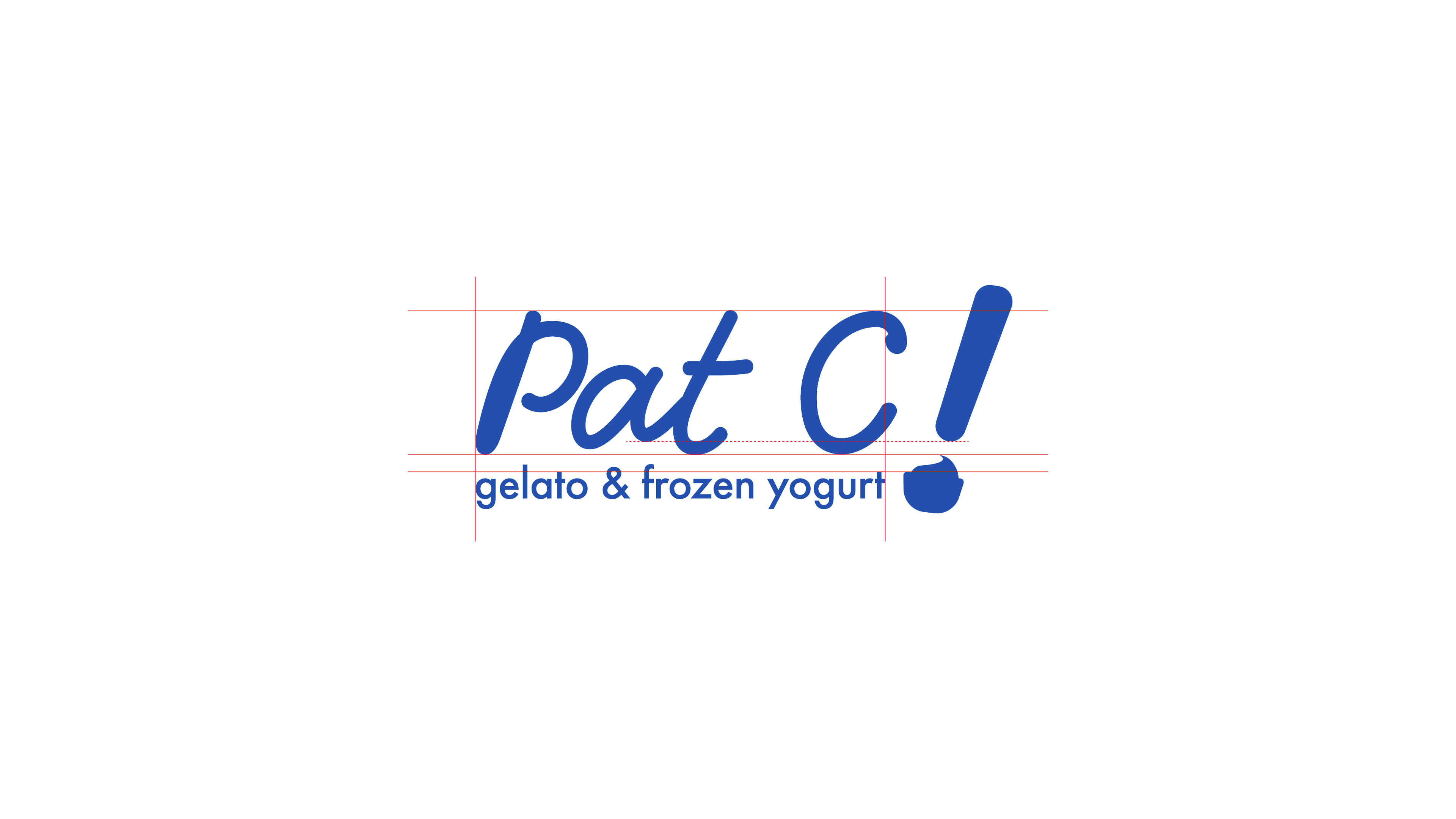
Logo Design
The logo concept is to highlight the taste of the product. Visualizing the emotions of surprise and delight after tasting the product, this approach will attract curiosity as to how good the flavors are. It’s an exclamation remark of ”delizioso!”
The cup and the swirl helps visualize the product so that customer understand what the company is selling, without having to solve the puzzle.
Color
Pat C! brand colors consist of neutral, minimalist colors (of a nunna place) with a pop of blue to bring out the cold beverage theme.

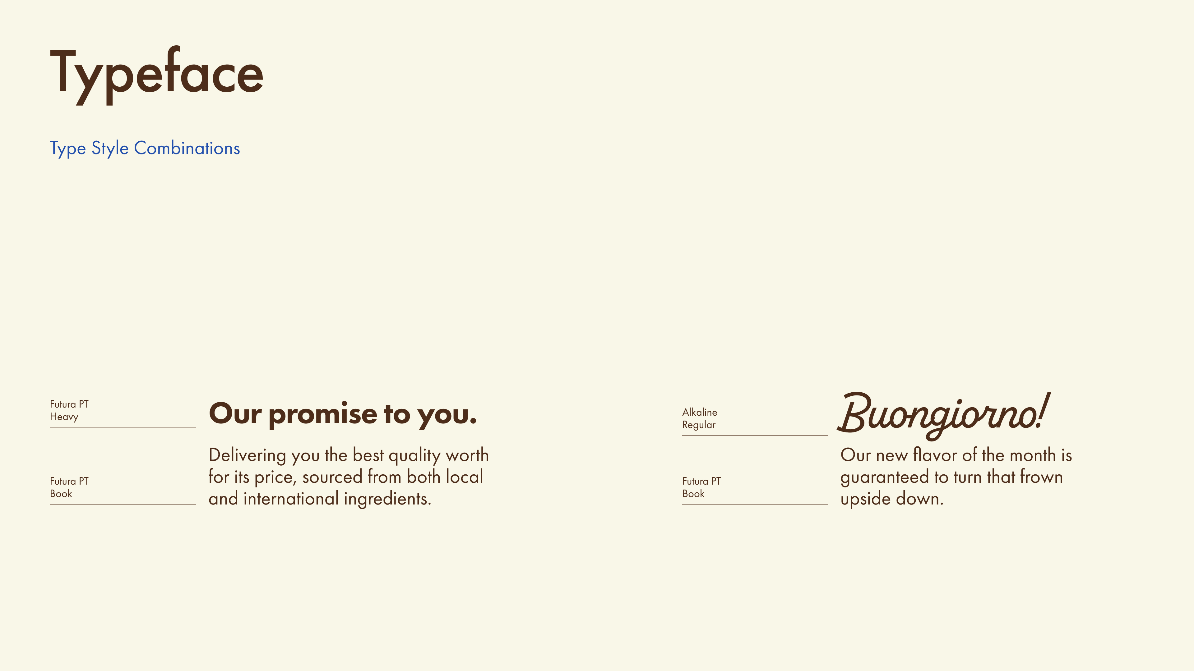
Typography and Type Style Combination


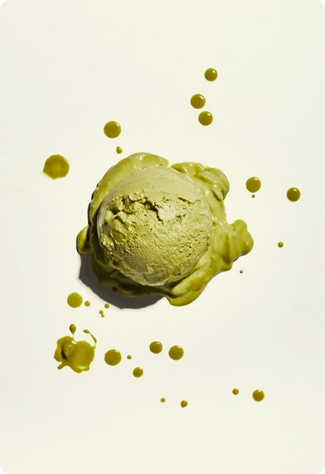
Visual Direction
*Please note that these are moodboard type of inspiration pictures that goes well with the brand. Copyright of each images goes to the rightful owners.


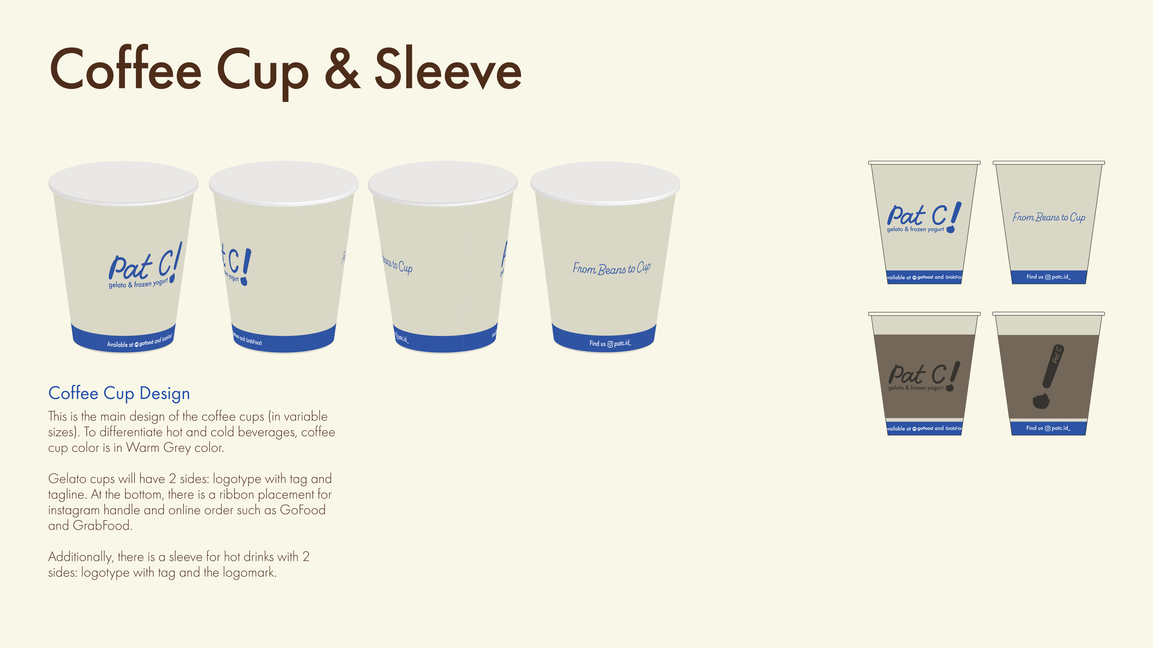
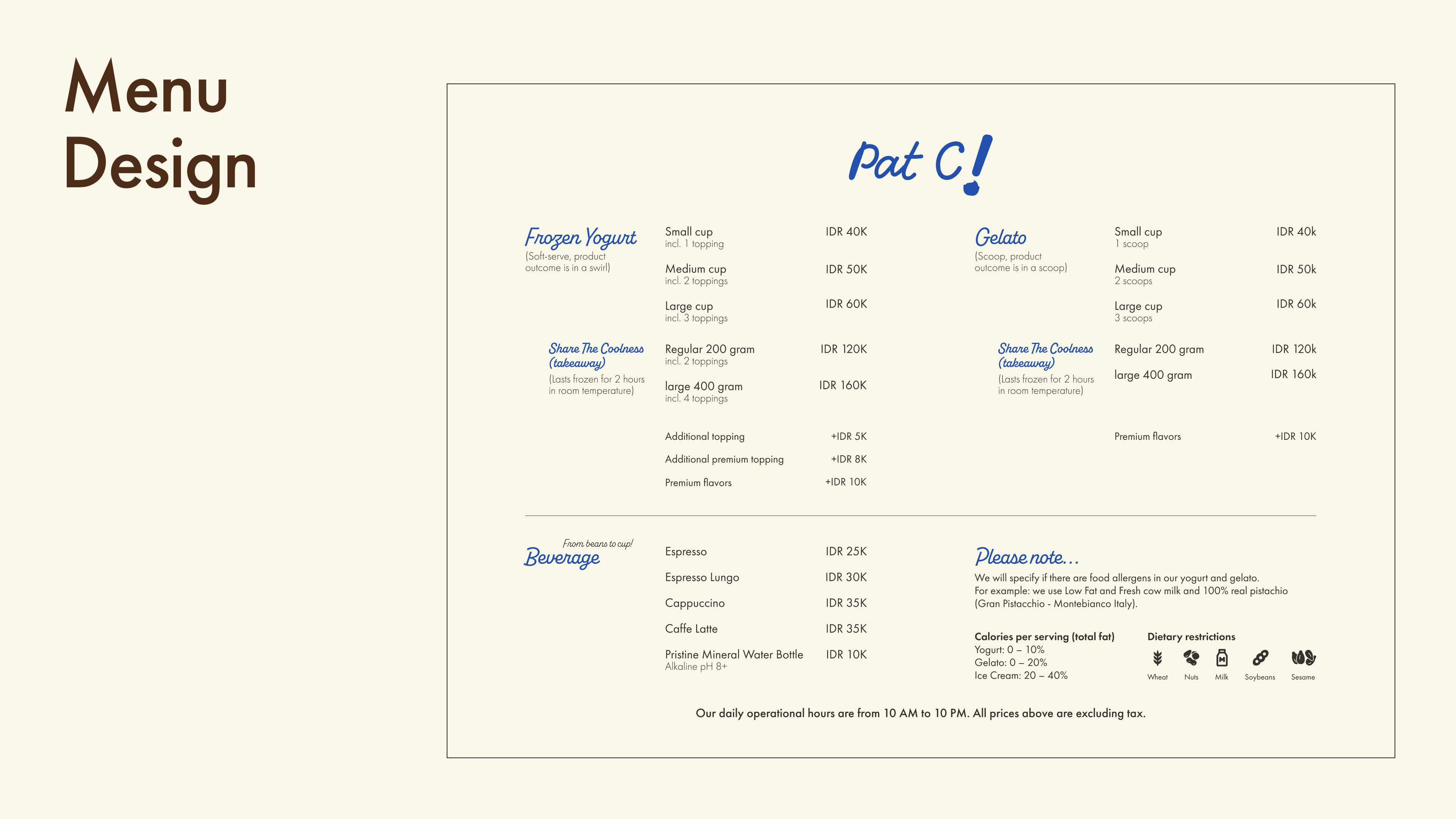
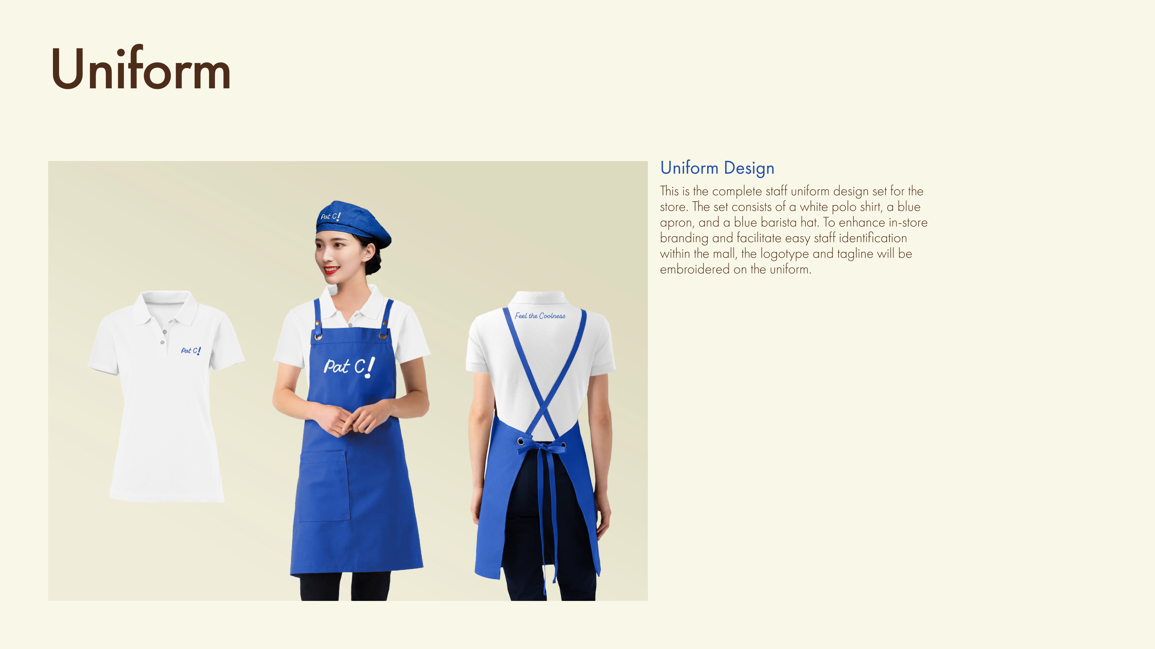
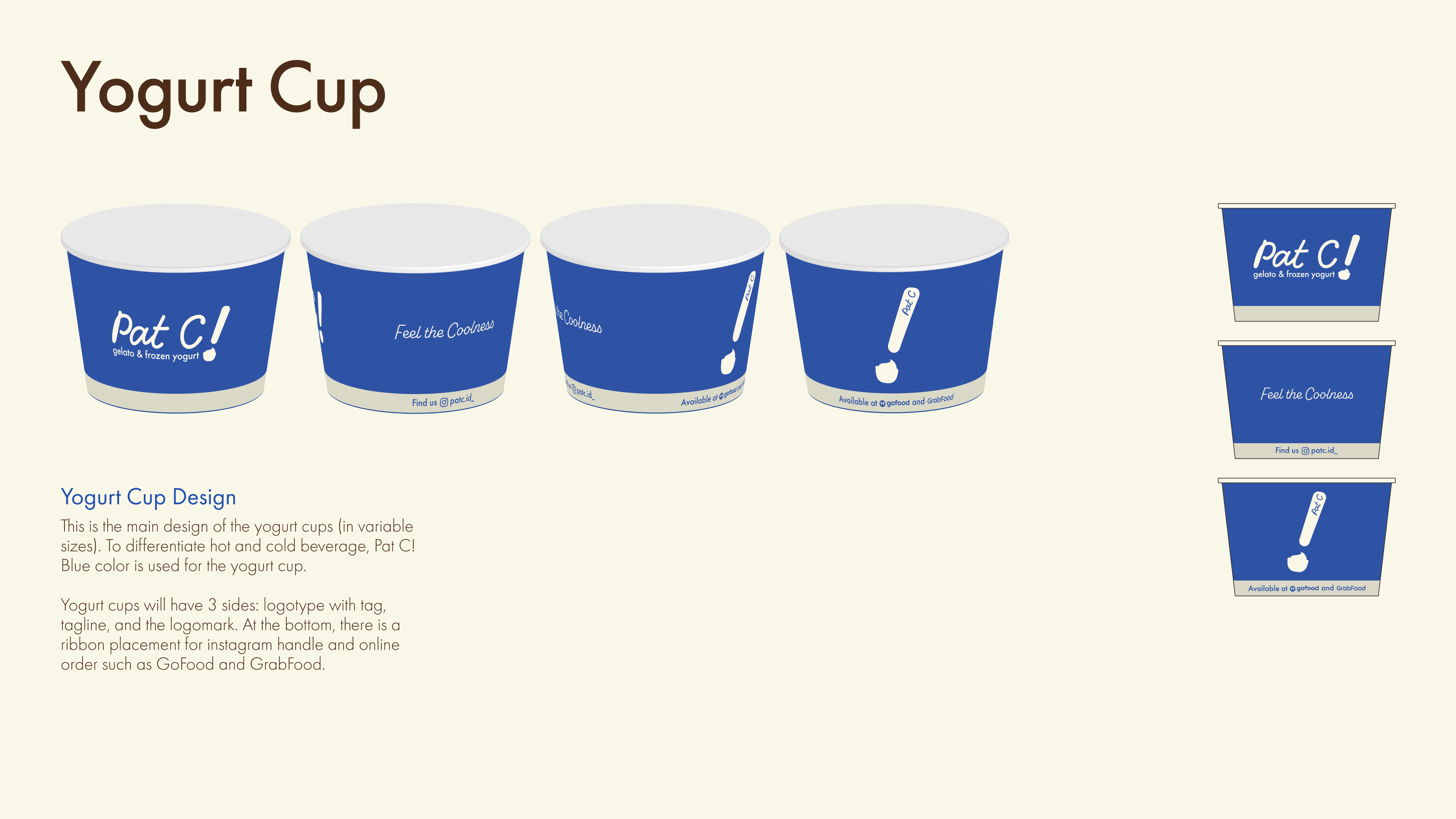
Applications
Please slide through the carousel to view: gelato cup, yogurt cup, hot cups, takeaway sleeve, uniform, and menu design.


SEE OTHER CASE STUDIES